
Release time:2021-03-23 17:21:09 Source: Edit:oreki Label:
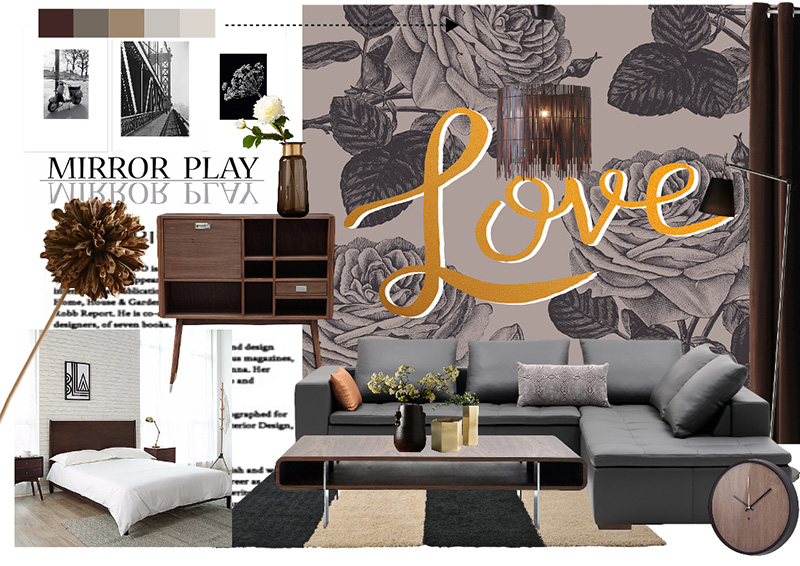
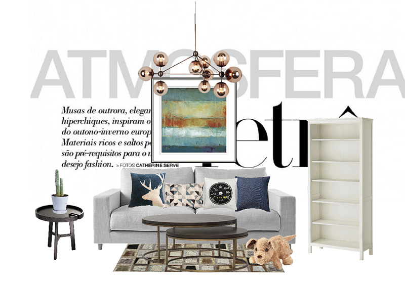
Soft decoration design and color matching seems simple, but in fact, very profound. More than 60% of the upholstery designers have special attainments in drawing and hand-painting. In the soft assembly color, clear the main color, can make people feel at ease. The main color is properly highlighted, and the focus can be formed visually, if the presence of the main color is weak. The overall tone will lack a sense of stability, with distinct primary and secondary.
Colors not only make people feel warm and cold, lightness, distance, lightness and darkness, but also arouse people's many associations.
Red: It is the color of blood, the most stimulating, it can easily make people think of passion, enthusiasm, beauty, auspiciousness, liveliness and loyalty, and can also make people think of danger, vulgarity and impetuousness. Too much exposure to red will make you feel stressed, agitated, and even exhausted. Therefore, there are no special circumstances, and red should not be used too much in the living room, bedroom, office, etc.
Yellow: Gives a noble and charming impression, can stimulate the mental system and digestive system, can also make people feel bright and happy, and help improve the ability of logical thinking. This color is often used in the costumes and palaces of ancient emperors, but the large use of golden yellow is prone to instability and arbitrariness in behavior. Therefore, yellow is best used with other colors for home decoration.
Green: It is the main theme of the forest, full of vitality, can remind people of new life, youth, health and eternity, and is also a symbol of fairness, quietness, wisdom, and humility. Green helps digestion and calmness, promotes body balance, and is extremely beneficial to the active and physically and mentally stressed. Natural green has a certain effect on overcoming syncope, fatigue and negative emotions.
Blue: The most reminiscent of the blue sea, after abstraction, it reminds people of deepness, loftyness, longevity, rationality and ideals. Blue is an extremely calm color. Blue easily provokes feelings of gloom, poverty, and coldness. It can relieve tension, relieve headaches, fever, insomnia and other symptoms, help adjust body balance, and make people feel elegant and peaceful. Purple: It has inhibitory effect on the motor nervous system, lymphatic system and heart system, can maintain the potassium balance in the body, and has a sense of security.
Black: It can make people think of being solid, reserved, solemn, and solemn, and it can also make people think of darkness. Gray: simple, but more of it reminds people of ordinaryness, emptiness, silence, coldness, melancholy, and despair.
White: It can make people think of cleanliness, innocence, innocence, light, sacredness, peace, etc., and can also make people think of pity and coldness.


 customer service
 make an appointment
 WeChat

 Phone
Phone